Tuesday, April 15, 2008

Optical Illusions

A common feature of optical illusions is having an illusion created by color. This especially deals with the tone of a color, whether it is darker or lighter.

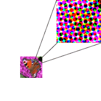
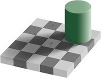
Two optical illusions I found especially interesting were these ones:


The image on the left is created by a technique called dither. This is created when the dots spread apart from each other, so while the smaller image looks as though it has a different pattern and color choice than the large diamond, it actually is the same. The dots in th upper image are just spread out more.

The second image is similarly deceitful. Point B may look as though it is a darker square, but it actually is the same color as square A. The squares around square B are darker, making square b to appear lighter than square A.

Tuesday, April 8, 2008

Color creates our Clothes

Very rarely do we think of the significance of color in our clothing. Obviously, clothing is rarely thought of in black and white terms, but imagine that it was. What would we gain? Well we would rarely have to match. We could wear two different pairs of socks and most likely nobody would notice. Perhaps wearing just tones would maybe even give us an air of sophistication. But more so, what would we lose?


Now whether he is in black and white, the same essence can be found. Sophistication. This is obviously what he was going for.


While the tones do not change too drastically, even a slight addition of color (her scarf, browns, and shirt) all dramatically improve in uplifting her outfit from drab to interesting.


With this outfit, there is much to grain with the addition of color. The very essence of her look is to be found in the bright, summery color. The mood is lost when just seen in tones.

When dressing, we don't consider on a daily basis the importance of color with our outfits. So much more is to be gained.

(Thanks to the Satorialist for the photos(http://thesartorialist.blogspot.com/).)

Disturb, Fake, Shock

Disturb, Fake, Shock- These are the three main themes I am covering for my final project. So let's better understand what these mean.

Disturb-
1. To break up or destroy the tranquility or settled state of.
2. To trouble emotionally or mentally; upset.

Fake-
noun, adjective
–verb (used with object)
1. prepare or make (something specious, deceptive, or
fraudulent)
2. to conceal the defects of or make appear more
attractive, interesting, valuable, etc., usually in order to
deceive
3. to pretend; simulate.
–noun
9. anything made to appear otherwise than it actually is;
counterfeit
10. a person who fakes; faker
–adjective a
13. designed to deceive or cheat; not real; counterfeit.

Shock-
3. a sudden or violent disturbance of the mind, emotions, or sensibilities: The burglary was a shock to her sense of security. The book provided a shock, nothing more.
4. the cause of such a disturbance: The rebuke came as a shock.

(Definitions according to dictionary.com)

Tuesday, March 25, 2008

Another Day at the Zoo

Once upon a time there was golden orange haired Golden Lion Tamarin, named Zoe. She lived in the greenest part of DC, the Smithsonian Zoo. She was stuck behind clear glass, which was okay though because she rarely had to work hard. Everyday she was fed fresh white bananas. The yellow peel was always already removed. This was done by the red head volunteer. All day she laid in the jungle green trees. Once in a while, she traveled down near the aqua clean pond.

This of course was until last Sunday, when all the children were dressed in the pale rainbow of nice dress clothes because it was Easter. It was the typical lazy Sunday, until Jake the coral corn snake snuck into Zoe's cage. Zoe had heard about Jake from the mousey gray ferret (who claimed all pinkish and orangish objects were poisonous), but she had never personally met Jake. At first Zoe was scared and hid in her brown house high in the trees. Jake slithered around on the green mossy floor until Zoe peeked out. She was at first frightened back into her home when she was Jake hissing with his pink tongue. Then Zoe re-emerged from behind the brownish wooden door and called out to Jake asking why he was here. Jake told Zoe "I followed a royal blue butterfly out of the reptile house and he led me here."

He continued to tell Zoe for the next half hour about his journey over the black tar that lead him to the small mammal house. Zoe eventually joined Jake on the green grassy floor, intrigued by his story. No longer was Zoe afraid of this orange and pinkish animal. Jake sooon slid back into the black hole in the corner and left after establishing Zoe and himself were friends. Life returned back to routine, but the next day when the volunteer fed Zoe an orange tangerine, she no longer backed away in fear, and instead was anxious to try something new.
Friday, March 14, 2008

The Lion

I guess I would have to feel even worse for the lion though. He doesn't see his prey (the zebra) as well because he is color blind, or only sees in black and white and gray. Could you imagine a life with out color? It would contradict all the concepts I had discussed in earlier blogs about color being used to help in symbolism or to evoke emotion. Our world revolves and depends on color.
As a film photographer I often deal with seeing the world in black and white. I have to predict what my world would look like in different tones when it meets the negative. Everyday I deal with a world of black and white and grays and I love it, but I can't always stay with it. Sometimes I need to bust out a color roll. I need color to help produce my images. But what if I never had that choice. I was always stuck in black and white? How would I approach my world then? Honestly I do not even know. I would probably just get frustrated like the lion who can't find his prey because of a handicap he was given that no one else had to deal with. I guess though, I would never have the ability to understand what it would be like and could not even imagine it because in the end our world depends on color whether we like it or not.

The Zebra

(http://www.african-safari-pictures.com)

Imagine the life of the Zebra. So plain, so dull. Always black and white. No variety. Not even a shade of gray. I've always hated gray to an extent. I mean I do like blakc and white photography, which is filled with gray, but in clothes or towels or sheets, I have found in to be quite boring. Recently though, I have learned that gray is so much more than just black and white. It is blue and orange or red and green, who knew that gray was actually the most exciting color of them all because it contained all the colors. As I type this though, it almost appears as a metaphor. I guess I am exagerating when I say gray is the most exciting just because it contained all of our favorite colors in to one. So does this mean that when all good things come together it becomes bland? Perhaps we need to bring one good thing to many bad things just so it can stand out.

Thursday, March 13, 2008

The Changing Sun

When you look out the window. Typically you see the same scene between the hours of 8 and 6. A sun and some clouds. Common, somewhat predictable. But with the simple action of even just looking through a window, often we are able to predict the weather. Grayish equals possibility of rain. Bluish equals a bright sunny typically good weathered day. Okay. Then there is the movies. Here a typical cloud and sun scene can depending on a certain color, help create the mood of the events about to take place. I guess this relates back to my previous blog about the common associations we have with colors.
Linnie, Esther, and I decided for our projects to play with this common scenario of a sun and clouds. We used this as our image and to mix the colors up for our project. Portrayed on a chocolate with frosting for a different play of mediums, we created different colors for each group of images (analogous, monochromatic, and complementary). We found this to be interesting because the common scenes can be easily changed depending on certain color selections. While we found frosting to be a difficult medium to work with, in the end we felt like we had achieved our goal by creating a new mood just depending on the color choice for certain objects.

Patriotic

I don't consider myselg anti-American. I never have. Even if I do say I want to leave this country as soon as possible, I would not say I hate my country. I do however hate the colors red, white, and blue. For some time now, I have found myself steering away from anything associated with the color combination- shoes bags, shirts, sheets, towels, even underwear. I find wearing your favorite colors for a team, school, or country to be unnecessary unless you are going to a special event. Showing your spirit through colors may be necessary at this time because people may understand it, but for daily use, no one does. You just look lame. Excuse me for my 4th grade vocabulary, but a better word choice does not come to mind at the moment. They make shirts and hats for spirit. No need for just random colors. Perhaps I'm being to harsh. Perhaps I'm being to narrow minded. Perhaps I just don't understand. Either way, you won't ever see me wearing my country's, schools, or team's colors.

(Thanks to http://picasaweb.google.com/bglove10/WhatIVeBeenUpToThePastMonth/photo#5093336919104594706)

Colors as symbols

Red sun at morning, sailors taking warning. Red sun at night sailor’s delight. Bizarre. I’m not going to sit here and pretend I have ever understood, and it rarely is true.

Yellow rubber ducky. I don’t honestly think I have ever seen a yellow duck, but maybe the ducklings are yellow?

Blue water. However, when it is glass I don’t see any color. It’s clear.

Purple grapes. In the grocery store there more red and green though.

Red head. Mostly red heads hair is orange though.

Girls pink. Boys blue. There really only some bland skin tone though.

Colors are something we all know and understand. They are common symbols for ideas, emotions, objects. Whether they make sense or not does not matter. Our society has taught us to know and agree that these colors are logically in the objects they represent. Regardless of what colors evoke in a person personally, most likely we have been taught to associate these colors with these ideas and feelings.

And I would like to end with a scary color. Rainbows have pots of gold. I only ever found bad luck is at the end of rainbows though.

Tuesday, February 12, 2008

The Brilliance of Red


For many years I have found myself identifying with the color red. The fiery color is representative of many emotions such as love, anger, hunger, alert, and fury. While each of these emotions can bee very different from each other, I find at their core they have the same root. These emotions are each linked with intensity and passion. I wonder sometimes whether it is the actual color I am attracted to if it is the feelings I associate with it. While I have never described myself as an intense person, I believe I am a very passionate person. I have often felt that red is the only color that could accurately portray me.

Red hair has often been a huge link between my favorite color and I. I'm not sure if red hair is often accompanied by personalities I find intriguing, or if subconsciously I am just attracted to red heads. My favorite Disney character was the Little Mermaid, my favorite Spice Girl was Geri, I used to religiously watch Lucille Ball in I Love Lucy, and I greatly admire the lead singer of Paramore, Hayley. For the past two years I have dyed my hair red as I am convinced I look better with it, but currently I am letting my hair get healthier. I contemplated dying my hair other colors, but I have realized it would be a mistake. In the end I know I will dye it red again, as red is the color I have become the most comfortable with.

Tuesday, January 29, 2008

The Effects of Color

When you look out the window, you see the world is full of colors: green money, yellow sun, blue water, black roads, red stop signs. Without realizing it, however, we are greatly effected by the commonsight of the colors of certain objects. We are brought up in a society that strongly attaches color to certain sensation. We associate them with
moods (grey=gloomy, blue=sad, yellow=happy, red=love), feelings (red=hot, blue=cool), and actions (green=go, red=stop, yellow=yield). Of course these can change slightly frm person to person or culture to culture, it depends on events in our history, but over all these are common associations with such colors. It is interesting to walk the streets, as we did today, to see how these color combinations are often used. Most of the time, the color schemes make sense, but every so often we can encounter one that makes us question the owners choice.
The first object I encountered was a yellow school bus. I found this to be a perfect color for a bus. It is a bright color, which would make a child happier. It is also the color commonly associated with yield. This also makes sense because other drivers should find the bus clearly visible and maybe even want to slow down because one wants to be careful while driving around with children. Because commonly we do not run into a lot of yellow cars, the bus is also more distinct on the road.
Next there were two objects who's color schemes did not make sense to me. First there was the banks colors which consisted of blue and white. I found this to be an odd choice for a bank. Commonly people would thinks of banks using green because money is the color green. Perhaps though they wanted the bank to seem calming and peaceful, like they would be trustworthy, so this could possibly be why they would choose to use the color scheme, although personally I do not find it an appealing color for a bank.
There was also a liquor store painted gray and used white. These colors found to be even more unappealing then the banks colors. While one in there mind may associate a liquor store with dirtiness, the store owner should want to make their store look more appealing. Maybe they would want to associate it with party colors so they could have used yellow or red or green or some kind of bright colors, like the festive party store down the street from the liquor store.


The last distinct object I found was a building who's color scheme was brown and gold. It was for an antique store. Gold and brown are an excellent color for an antique store for three reasons. The colors make me think of furniture, older objects, and desrable pricey objects. Although antiques do not necessarily y have to be expensive, brown paired with gold seems more desirable old fashioned colors.