 (Thanks to http://picasaweb.google.com/bglove10/WhatIVeBeenUpToThePastMonth/photo#5093336919104594706)
Thursday, March 13, 2008
Patriotic
I don't consider myselg anti-American. I never have. Even if I do say I want to leave this country as soon as possible, I would not say I hate my country. I do however hate the colors red, white, and blue. For some time now, I have found myself steering away from anything associated with the color combination- shoes bags, shirts, sheets, towels, even underwear. I find wearing your favorite colors for a team, school, or country to be unnecessary unless you are going to a special event. Showing your spirit through colors may be necessary at this time because people may understand it, but for daily use, no one does. You just look lame. Excuse me for my 4th grade vocabulary, but a better word choice does not come to mind at the moment. They make shirts and hats for spirit. No need for just random colors. Perhaps I'm being to harsh. Perhaps I'm being to narrow minded. Perhaps I just don't understand. Either way, you won't ever see me wearing my country's, schools, or team's colors.
(Thanks to http://picasaweb.google.com/bglove10/WhatIVeBeenUpToThePastMonth/photo#5093336919104594706)
(Thanks to http://picasaweb.google.com/bglove10/WhatIVeBeenUpToThePastMonth/photo#5093336919104594706)
Colors as symbols
Red sun at morning, sailors taking warning. Red sun at night sailor’s delight. Bizarre. I’m not going to sit here and pretend I have ever understood, and it rarely is true.
Yellow rubber ducky. I don’t honestly think I have ever seen a yellow duck, but maybe the ducklings are yellow?
Blue water. However, when it is glass I don’t see any color. It’s clear.
Purple grapes. In the grocery store there more red and green though.
Red head. Mostly red heads hair is orange though.
Girls pink. Boys blue. There really only some bland skin tone though.
Colors are something we all know and understand. They are common symbols for ideas, emotions, objects. Whether they make sense or not does not matter. Our society has taught us to know and agree that these colors are logically in the objects they represent. Regardless of what colors evoke in a person personally, most likely we have been taught to associate these colors with these ideas and feelings.
And I would like to end with a scary color. Rainbows have pots of gold. I only ever found bad luck is at the end of rainbows though.
Tuesday, February 12, 2008
The Brilliance of Red

For many years I have found myself identifying with the color red. The fiery color is representative of many emotions such as love, anger,
 hunger, alert, and fury. While each of these emotions can bee very different from each other, I find at their core they have the same root. These emotions are each linked with intensity and passion. I wonder sometimes whether it is the actual color I am attracted to if it is the feelings I associate with it. While I have never described
  myself as an intense person, I believe I am a very passionate person. I have often felt that red is the only color that could accurately portray me.
Red hair has often been a huge link between my favorite color and I. I'm not sure if red hair is often accompanied by
 personalities I find intriguing, or if subconsciously I am just attracted to red heads. My favorite Disney character was the Little Mermaid, my favorite Spice Girl was Geri, I used to religiously watch Lucille Ball in I Love Lucy, and I greatly admire the lead singer of Paramore, Hayley. For the past two years I have dyed my hair red as I am convinced I look better with it, but currently I am letting my hair get healthier. I contemplated dying my hair other colors, but I have realized it would be a mistake. In the end I know I will dye it red again, as red is the color I have become the most comfortable with.
Tuesday, January 29, 2008
The Effects of Color
When you look out the window, you see the world is full of colors: green money, yellow sun, blue water, black roads, red stop signs. Without realizing it, however, we are greatly effected by the commonsight of the colors of certain objects. We are brought up in a society that strongly attaches color to certain sensation. We associate them with
moods (grey=gloomy, blue=sad, yellow=happy, red=love), feelings (red=hot, blue=cool), and actions (green=go, red=stop, yellow=yield). Of course these can change slightly frm person to person or culture to culture, it depends on events in our history, but over all these are common associations with such colors. It is interesting to walk the streets, as we did today, to see how these color combinations are often used. Most of the time, the color schemes make sense, but every so often we can encounter one that makes us question the owners choice.
 The first object I encountered was a yellow school bus. I found this to be a perfect color for a bus. It is a bright color, which would make a child happier. It is also the color commonly associated with yield. This also makes sense because other drivers should find the bus clearly visible and maybe even want to slow down because one wants to be careful while driving around with children. Because commonly we do not run into a lot of yellow cars, the bus is also more distinct on the road.
 Next there were two objects who's color schemes did not make sense to me. First there was the banks colors which consisted of blue and white. I found this to be an odd choice for a bank. Commonly people would thinks of banks using green because money is the color green. Perhaps though they wanted the bank to seem calming and peaceful, like they would be trustworthy, so this could possibly be why they would choose to use the color scheme, although personally I do not find it an appealing color for a bank.
 There was also a liquor store painted gray and used white. These colors found to be even more unappealing then the banks colors. While one in there mind may associate a liquor store with dirtiness, the store owner should want to make their store look more appealing. Maybe they would want to associate it with party colors so they could have used yellow or red or green or some kind of bright colors, like the festive party store down the street from the liquor store.


The last distinct object I found was a building who's color scheme was brown and gold. It was for an antique store. Gold and brown are an excellent color for an antique store for three reasons. The colors make me think of furniture, older objects, and desrable pricey objects. Although antiques do not necessarily y have to be expensive, brown paired with gold seems more desirable old fashioned colors.
moods (grey=gloomy, blue=sad, yellow=happy, red=love), feelings (red=hot, blue=cool), and actions (green=go, red=stop, yellow=yield). Of course these can change slightly frm person to person or culture to culture, it depends on events in our history, but over all these are common associations with such colors. It is interesting to walk the streets, as we did today, to see how these color combinations are often used. Most of the time, the color schemes make sense, but every so often we can encounter one that makes us question the owners choice.
The first object I encountered was a yellow school bus. I found this to be a perfect color for a bus. It is a bright color, which would make a child happier. It is also the color commonly associated with yield. This also makes sense because other drivers should find the bus clearly visible and maybe even want to slow down because one wants to be careful while driving around with children. Because commonly we do not run into a lot of yellow cars, the bus is also more distinct on the road.Next there were two objects who's color schemes did not make sense to me. First there was the banks colors which consisted of blue and white. I found this to be an odd choice for a bank. Commonly people would thinks of banks using green because money is the color green. Perhaps though they wanted the bank to seem calming and peaceful, like they would be trustworthy, so this could possibly be why they would choose to use the color scheme, although personally I do not find it an appealing color for a bank. There was also a liquor store painted gray and used white. These colors found to be even more unappealing then the banks colors. While one in there mind may associate a liquor store with dirtiness, the store owner should want to make their store look more appealing. Maybe they would want to associate it with party colors so they could have used yellow or red or green or some kind of bright colors, like the festive party store down the street from the liquor store.

The last distinct object I found was a building who's color scheme was brown and gold. It was for an antique store. Gold and brown are an excellent color for an antique store for three reasons. The colors make me think of furniture, older objects, and desrable pricey objects. Although antiques do not necessarily y have to be expensive, brown paired with gold seems more desirable old fashioned colors.
Tuesday, December 11, 2007
The Power of the Image
 (http://www.istockphoto.com/file_closeup/?id=2504213&refnum=834388)
Our world is full of pictures to depict a quick and understandable meaning. These pictures are displayed in several ways. There is a sign which has an image to communicate an idea like a road sign that all drivers knows means yield and be wary of pedestrians. Then there are symbols which represent a word like & (which means and). Companies or teams like to use logos to identify and differentiate themselves like the one at& t uses below:
 (http://design.weblogsinc.com/2005/11/22/at-t-rebranded-wait-no-reinvigorated/)
Or there are also icons which are images to epresent and communicate ideas like the energizer bunny representing the Energizer battery.

(http://familyo.blogspot.com/2007_01_01_archive.html)
While basically all 4 concepts have similar motivations, they each have a slightly different meaning. While researching the web on the concepts of logos I found many of them to be very simple. But simple images can hold very important meaning. I believe one of the most well known logos in the world would have to be the olympic rings:
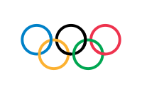 I feel as though this logo really simply, but smartly sums up the Olympics. Many cultures and ideas coming together. t was a very creative way to communicate the ideas.
(http://en.wikipedia.org/wiki/Olympic_Games)
I aso found that often logos are something that is easier for different cultures and countries to identify with. Another logo that can be commonly communicated through different languages is symbols from different religons, especially christianity's cross. Logos show the power of the image and the power of visual communication.
Tuesday, December 4, 2007
Gestalt
Gestalt is based on the theory that shapes and lines can help form likeness of figures. It is commonly used in psychotherapy and understanding others. This is similar to the project we had just completed because although we had only one shape, the shape helps create a figure.
 This image is similar to the ideas of gesalt because while the shapes are nothing more than simple shapes, it resembles 2 faces to some or a vase to others. It depends on how one uses the positive and negative space. Often used in psychoanalyzes, it shows how powerful images can be and minds can interpret things differently based on genetics and previous experiences.
(Picture from the Gestalt Association web page)
This image is similar to the ideas of gesalt because while the shapes are nothing more than simple shapes, it resembles 2 faces to some or a vase to others. It depends on how one uses the positive and negative space. Often used in psychoanalyzes, it shows how powerful images can be and minds can interpret things differently based on genetics and previous experiences.(Picture from the Gestalt Association web page)
Tuesday, November 6, 2007
Performance art is an interesting subject matter. One can make the performance very fun or very boring. My performance piece I created to be performed by 2 others was called the Flaming Flailing Phoenix. What was originally supposed to happen was they were supposed to stand across from each other. Then each took 2 incense sticks and they would light them. Then they would take one in each hand and wave their arms around to create designs with the burning incense sticks. This was to be done until the sticks burned out, or put them out in a cup of water. There was another piece, which was to incorporate incense as well. The piece was called Silent Sitting Senses. It consisted of sitting And watching the incense sticks burn. It would be very Zen like. Linnie Beard created this one. What was interesting by the performers who carried out each of our pieces is they decided to combine the two pieces. This I believe actually enhanced them. The pieces were combined so there were 4 people flailing their arms and sitting in the Safeway parking lot. Being in such a public place also enhanced the experience because it is always fun to see a stranger’s reaction. Mostly they were upset to be bothered by the artists. I guess busy grocery shoppers don’t have much of a sense of humor.
Subscribe to:
Posts (Atom)